WWF Energy Dashboard
- Data Visualization Design
- UI Design
- HTML/CSS Development
- Figma
- Illustrator
Context
The goal of the project was to create custom dynamic plots on energy-related topics, making the content easily understandable for the average visitor on the WWF Germany website.
Objectives
- Create custom dynamic plots on key energy-related topics and statistics for Germany.
- Follow the existing client design guidelines and branding.
- Use a grid view to display the plots visually.
- Implement the solution so it can be easily integrated into an iFrame and be responsive.
Design and Development Process
- Received initial sketches from partners and turned them into mockups for further improvement.
- Created custom data visualization designs while using the visual guidelines of WWF Germany.
- Iterated through several cycles of feedback and improvement while slowing starting the front-end development process.
- Worked on responsive design by creating guidelines on how to implement the app's grid.


Data Visualization Design
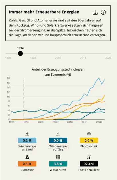
- Simplified the initial chart sketches by prioritizing content and cutting out some parts in order to focus on the most valuable content, creating a visual and interactive storytelling.
- Focused on chart types that are easy to decode, such as column or line charts, removing charts that are more difficult to use for comparison of more than two values, such as the pie charts.
- Added visual cues, such as icons, to improve readability, as well as using brand colors and styling, in order to make the interface more enjoyable and recognizable.


Results
- Developed an interactive dashboard featuring 11 dynamic visualizations, making complex energy data more understandable and accessible for the general public visiting the WWF Germany website.
- Successfully aligned the data visualization designs with WWF’s branding guidelines, enhancing both the aesthetic appeal and usability of the dashboard.
Reflections
As any data visualization process, it is important to start with the most important question: 'What message do we want to give to the reader?'. From there it is possible to make content and design decisions so that the end user can decode the information as intended.
It is also important to help the reader as much as possible by using easy to decode charts. Simple charts don't have to be boring and can actually increase usability and make the process of decoding data more enjoyable. Custom charts can also be valuable if used properly, which might be a hard task, especially for interactive charts, as values can vary greatly within a single chart, which can make it harder to read and compare values.
Custom charts provide a unique perspective on data, but in other projects, using ready-made charts might be sufficient to reduce technical complexity and save resources. It is also crucial to find the balance between the right amount of information and good readability during the design process. For this, design processes and data visualization must work closely together.